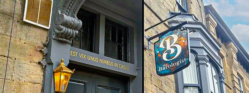
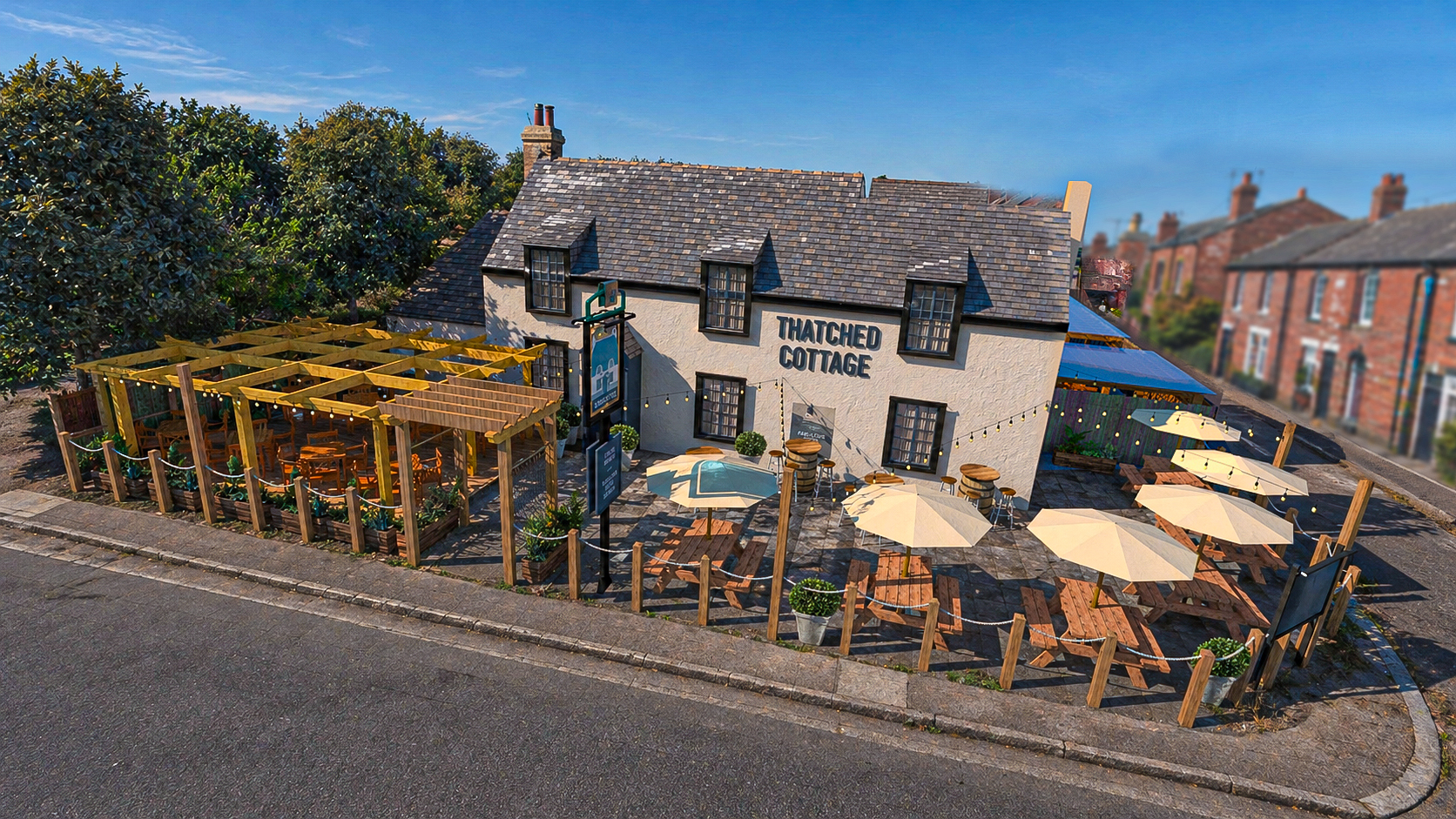
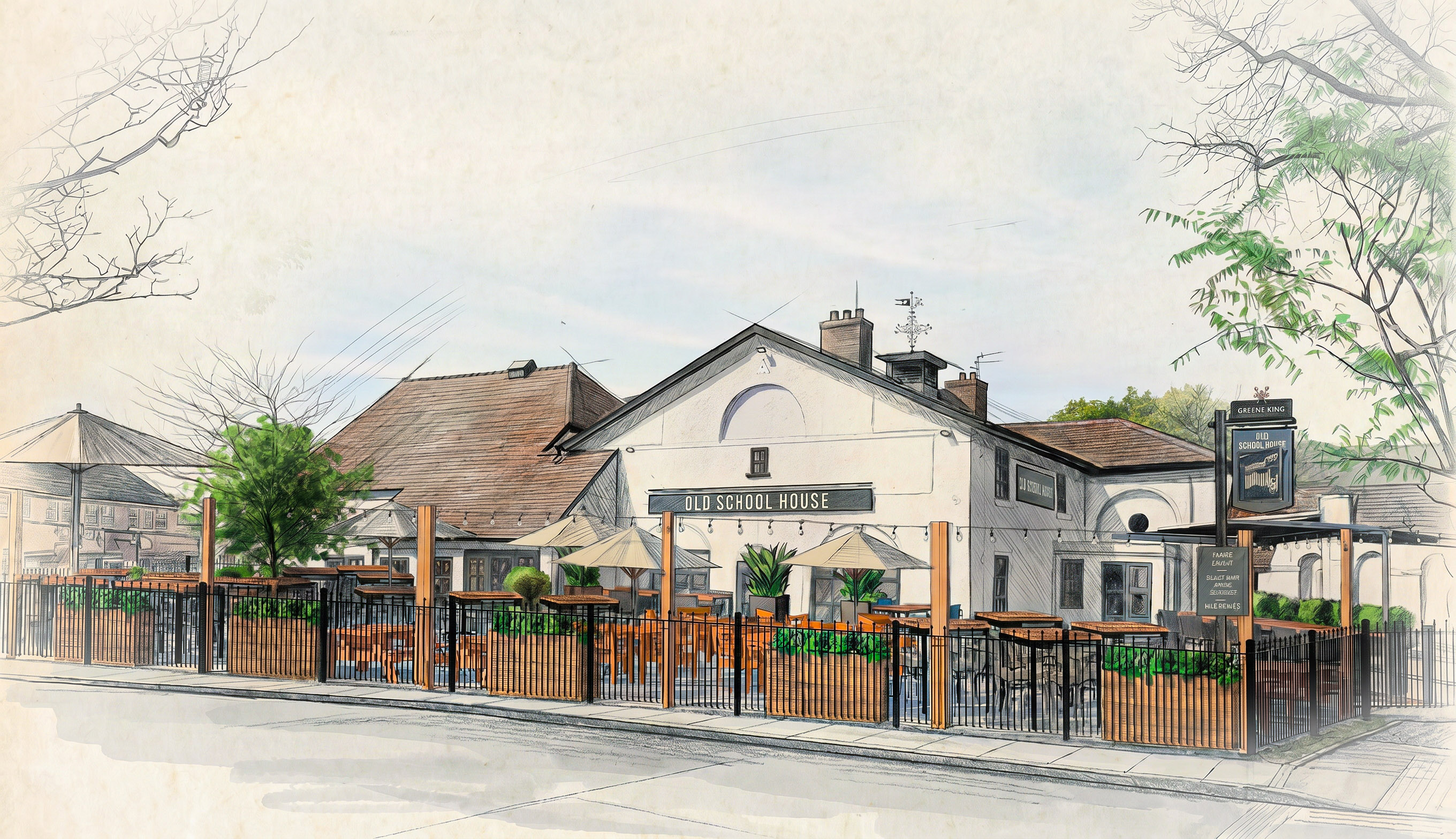
Design that earns
attention.

Senior Brand Designer specialising in hospitality and retail environments. For 19+ years, I've delivered complete brand systems for major UK businesses — from identity development and bespoke brand assets through to environmental design, multi-site rollout, and content creation that drives commercial results.

Core expertise: brand identity and illustration systems, environmental graphics and wayfinding, retail signage, content creation (photography and video), and 3D visualisation. Equally comfortable leading projects end-to-end, embedding with in-house teams, or acting as the creative bridge between strategy and execution.

Retail & Hospitality
Environmental brand design for major UK retail and hospitality clients including Mercedes-Benz, Co-op, Notcutts, and Waitrose. Translating brand guidelines into comprehensive wayfinding and signage systems that guide customer journeys whilst reinforcing brand identity at every touchpoint. Delivered end-to-end: from brand interpretation and design development through to technical specifications, production liaison, and national multi-site rollout. The Mercedes-Benz retail programme spanned 136 showrooms nationwide, and the Co-op template and guideline system I developed rolled out across hundreds of stores — and remains in use today.
Co-op Baker Street
Concept Store · Listed Building · London Underground
Co-op
Co-op
Brand Templates & Guidelines · National Rollout (Still in Use)
Mercedes-Benz Stockport
Mercedes-Benz
Retail Signage · Wayfinding · National Programme (136 Showrooms)
Notcutts
Notcutts
Environmental Identity · Signage System · 19-Site Rollout
Waitrose Sheffield
Waitrose Sheffield
Signage Production · Technical Drawing from Architect Elevations
Case Study
Mercedes-Benz — Precision at National Scale
The Challenge
Mercedes-Benz operates one of the most tightly governed visual identities in the automotive world — a global brand standard that allows no drift. The task wasn't to invent an identity but to deliver it with absolute fidelity across 136 showrooms nationwide. Every site had its own architecture, footprint, and constraints; every site had to end up unmistakably, consistently Mercedes-Benz. The discipline was in the detail — applied 136 times without a single weak link.
The Approach
I translated the Mercedes-Benz retail brand programme into a complete wayfinding and signage execution — developing the rollout templates, technical specifications, and site-by-site application drawings. Where individual showroom architecture pushed against the standard, the solution was always to honour the brand system while resolving the constraint, so that consistency never came at the cost of a sign that didn't fit its building.
The Result
A national retail programme delivered across 136 showrooms to a single, uncompromising brand standard — proof that brand consistency and site-specific problem-solving aren't opposing forces, but the same discipline applied with care and efficiency gain, saving manufacturing time and materials. National Mercedes-Benz retail signage and wayfinding programme — brand-standard execution delivered with precision across 136 showrooms.
Case Study
Notcutts — From One Logo to a Brand Environment
The Challenge
Notcutts arrived with a single deliverable in hand: a finished logo. Everything else had to be built from the ground up — typeface hierarchy, colour system, signage architecture, material specification, and a full set of application guidelines. And it couldn't just work in theory: the system had to hold together across 19 garden centres, each housed in a strikingly different building, on a different site, with its own character and constraints.
The Approach
I developed a complete signage and environmental identity around that single logo — establishing the typefaces, colour language, and a flexible, modular family of sign types spanning external fascia, entrance markers, internal wayfinding, and category signage. Because no two locations were alike, every application was bespoke: timber arbours and entrance features at some sites, freestanding signposts at others, suspended or wall-mounted solutions wherever the architecture demanded — so the brand always felt purpose-made for its setting rather than imposed upon it.
The Result
A single piece of artwork grew into a fully realised brand environment, rolled out thoughtfully and consistently across all 19 sites. What began as one logo became a coherent visual language — one that gives every Notcutts location a sense of place while remaining unmistakably part of the same family. A complete environmental brand system — typography, colour, signage architecture, and guidelines — developed from a single logo and deployed across 19 architecturally distinct garden centres nationwide.
Case Study
Co-op National Signage Programme
The Challenge
Co-op joined as a new client just two weeks before the country went into lockdown. With stores inaccessible and a national programme to deliver, the entire internal and external signage template system had to be created remotely — and solely by me. The estate was vast and hugely varied: high-street convenience stores, underground station concourses and grade-listed buildings, each carrying its own set of technical and regulatory constraints.
The Approach
I built a modular template system designed for flexibility, later applied to hundreds of stores nationwide. New sub-brands were proposed for selected locations — typically concept stores — each requiring its own signage family. Where ceiling heights and store layouts ruled out conventional signage, I developed and introduced entirely new wayfinding systems, researching and applying new recycled materials in the process. Underground station sites called for specialist fire-rated recycled materials, and for listed buildings I adapted a sympathetic new look and feel that respected heritage planning while staying true to the brand.
The Result
A comprehensive, production-ready signage system rolled out across hundreds of Co-op stores — delivered through one of the most challenging periods in recent memory. The programme introduced genuinely new thinking: sustainable material choices, flexible wayfinding solutions and a concept-store sub-brand language designed to evolve with the estate for years to come.
Case Study
Waitrose Internal Signage Rebrand
The Challenge
Waitrose called for a comprehensive refresh of its internal signage — a fresh, clean, contemporary look that reflected the brand's premium positioning, rolled out across a dozen very different sites. From new-build formats to established stores carrying older signage, each location brought its own spatial realities and material considerations.
The Approach
The design direction was deliberately clean and modern — a confident evolution of the Waitrose identity rather than a departure from it. I developed solutions across the full range of sign types and applications, specifying new materials throughout: illuminated lightboxes, individual wall-mounted lettering and signs, category fins and overhead navigation. Material selection was central — chosen to hold the premium feel consistently across very different store environments, with longevity and practical upkeep in mind.
The Result
A cohesive, contemporary signage system rolled out across the programme of sites — one that visibly lifted the in-store experience and felt genuinely premium in its material execution. Clean lines, considered materials and a fresh modern finish that lets the product remain the hero.
Hospitality Brand Identity
Every pub has a personality, and the best branding makes that tangible. For each of these projects, the starting point was understanding what made that particular venue distinct — its history, its location, its vision — and translating that into a visual identity that felt genuinely earned.
Each project required a complete brand system: logo development, typography, colour palettes, illustrative elements, interior design integration, and comprehensive application guidelines. Delivered across signage, menus, uniforms, digital assets, and physical environments — creating cohesive brand experiences that resonate with customers and strengthen venue identity.
Queens Head
Brand Identity · Environmental Design
Watchmakers
Watchmakers
Brand Identity · Rebrand
House of Mobo
House of Mobo
Brand Extension · Interior Integration
Barologist
Barologist
Brand Identity · Rebrand
Royal
Royal
Brand Identity · Rebrand
Photography & Content
Professional photography and videography capturing completed brand projects for marketing deployment. Shot on location to showcase finished environments and installations, these images and films support client case studies, LinkedIn campaigns, social media content, and new business pitches. Part of a full-service approach to brand delivery — designing the environment, executing the installation, and creating the content that tells the story from concept to completion.
ASDA Tottenham
ASDA Tottenham
Boat House
Boat House
M&S
M&S
Malt House Birmingham
Old Bank
Old Bank
PureGym Peterborough
Ramada
Ramada
White Horse
White Horse
3D Rendering
Photorealistic 3D visualisation for environmental, architectural, and product design proposals. Created in SketchUp and V-Ray to present spatial concepts to clients before fabrication — reducing costly revisions, accelerating approval processes, and enabling stakeholders to experience brand environments before production begins. From initial concept visualisation through to final photorealistic renders for client presentations and marketing materials.
The Falcon
The Falcon
3D Rendering
Wingstop
Wingstop
3D Rendering
Thatched
Thatched
3D Rendering
Old School
Old School
3D Rendering
Brand Identity
Each commission began with a brief and an existing brand framework to work within. These bespoke brand illustrations were created to complement already-approved marketing guidelines, matching tone, colour language and visual hierarchy whilst bringing something handcrafted and distinctive to the work. Designed as scalable brand assets, each illustration system was deployed across multiple touchpoints: feature signage, staff uniforms, menus, table POS, merchandise, and social media — maintaining brand consistency whilst adding warmth and character to every customer interaction.
Pub And Social Brand
Visual Identity
Flaming Grill
Flaming Grill Brand
Visual Identity
Peoples Pub
Peoples Pub Brand
Visual Identity Assets
Pubs & Restaurants
Pubs & Restaurants
Visual Identity
Nest
Nest Brand
Visual Identity
Case Study
GK Flaming Grill Rebrand
The Challenge
Greene King's marketing team had signed off on bold, contemporary brand guidelines — vivid yellow backgrounds, heavy modern typography, a strong departure from tradition. The challenge: how to honour that brief whilst preserving the traditional pub character customers expect. A purely modern execution risked feeling out of place in the very venues it was designed for. The brand needed assets that could bridge corporate direction with on-the-ground hospitality authenticity.
The Approach
The solution was to root the illustration content in pub heritage — subject matter drawn from the craft of keeping, local culture, and trade history. Rather than fighting the modern guidelines, the illustrations were produced as grey-tone pictorial works: traditional in content, contemporary in execution, and clean enough to sit comfortably within the approved brand system. Designed as a complete brand asset system for deployment across: Feature signage and environmental graphics, Staff uniforms and workwear (embroidered applications), Menu design and table POS materials, Branded merchandise and collateral, Social media and digital marketing
The Result
A suite of brand illustrations that bridged corporate brand direction with the warmth customers expect from a pub environment. The grey-tone pictorial aesthetic was reinterpreted as a modern, versatile series — traditional at heart, contemporary in execution, and deployable across the full brand ecosystem from signage to social media. Deployed across 50+ Greene King pub locations nationally. The success of the illustration system led to its adoption for additional Greene King pub brands.
Storytelling
Commissioned video content capturing the journey from design concept to completed brand environment. Shot and edited to reflect each venue's brand personality — not just document installations, but tell compelling stories for LinkedIn campaigns, Instagram reels, client case studies, and new business pitches. Designed for social media performance: optimised for platform specs, edited for engagement, and crafted to showcase brand transformation in 60-90 seconds.
The Falcon
M&B Castle · LinkedIn · 2025
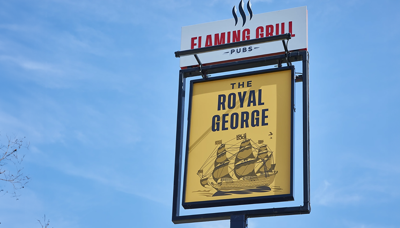
The Crown and Sceptre
M&B Castle · LinkedIn · 2026
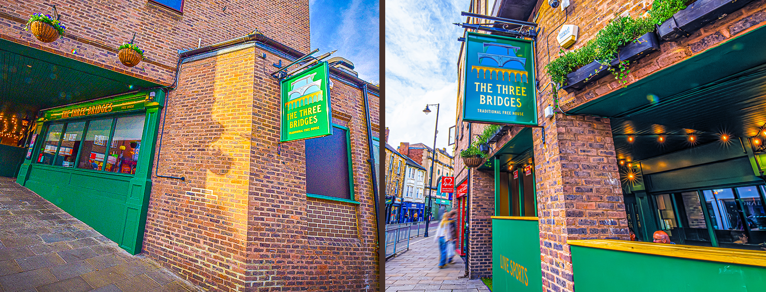
Hyndland Rock
M&B Nicholsons Pubs · LinkedIn · 2026
The Hogarth
Fullers · Instagram · 2021
Let's work together
Available for roles in Leeds, Manchester & hybrid UK
Senior Graphic Designer · Brand Implementation & Environmental Design

📞 07954 179 675